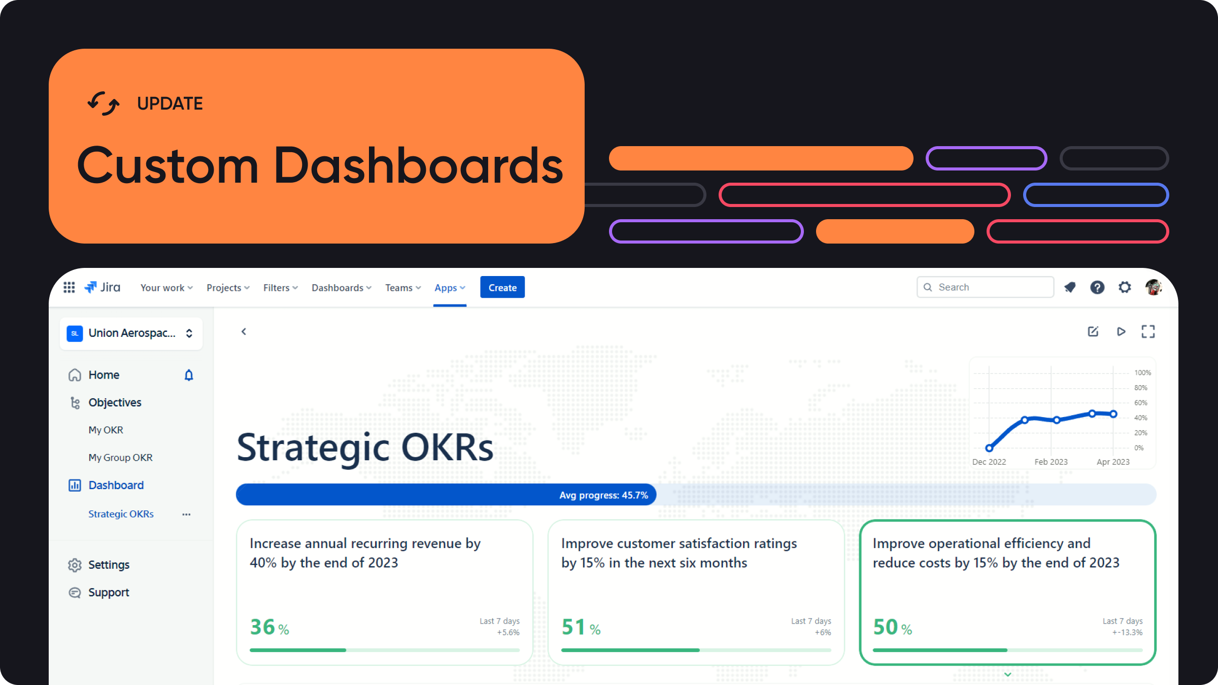
UPDATE: As of June 27, you can add up to 10 Objectives into any Custom Dashboard. You can also export it as a PDF in one click.
We at Oboard are always hard at work adding new features to the OKR Board apps — and this one has been requested for a very long time! With the April update, we are introducing Custom OKR Dashboards for reporting and at-a-glance monitoring — and we would like to thank several of our enterprise customers for their input and inspiration.
One of the biggest suggestions our enterprise customers had was a way to see all of the overall company OKR progress at the same place. They also had an issue with employees being lost in tactical OKRs, forgetting about company-wide Objectives. Finally, they needed a way to create focused Dashboards that contained only the most relevant data without any distractions. Custom OKR Dashboards are here to solve all of those issues.
If you want to learn more about the OKR Dashboards overall, we have a great breakdown of them in our OKR Dashboard guide.
What is a Custom OKR Dashboard
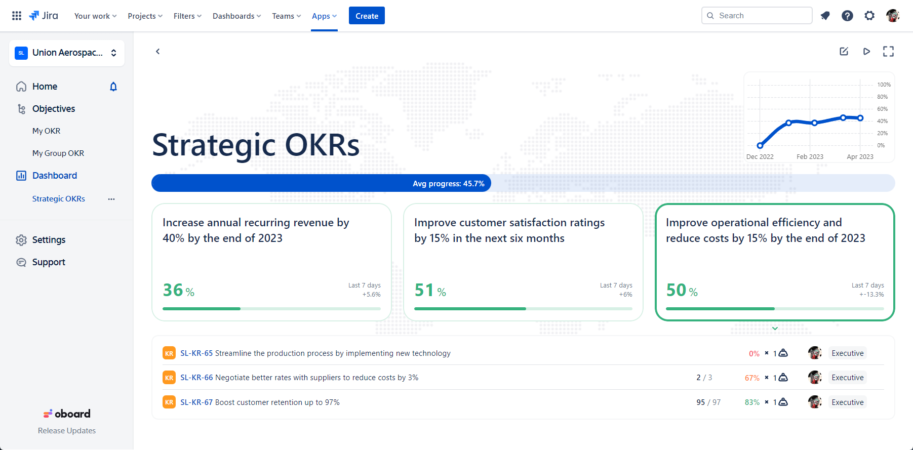
Custom OKR Dashboard is an executive reporting tool that shows only the Objectives and Key Results you need, as well as all the necessary stats and progress reports on them. It is available in OKR Board for Jira and OKR Board for Salesforce and can be accessed by clicking the … tab. Depending on your use case, a Custom OKR Dashboard can be either a customizable report or a C-level dashboard.
Custom OKR Dashboards for Reporting
When it comes to reporting, selecting the data to display is only half the battle — the other half is pruning the report from irrelevant information that obscures the point. And while one could already use Board or Dashboard views for reporting, they still contain quite a bit of data that is not needed to provide a clear picture. This is where Custom OKR Dashboard comes in, helping you to power up your reports even further.
Essentially, you get to pick the Objectives and Key Results you want to present on the Custom OKR Dashboard, as well as how exactly you want to present them. This results in a hyperfocused C-level report that contains only the relevant data and makes it much easier to understand.

For example, a VP of Manufacturing could have multiple Dashboards for each of the directions they manage — one Department-level Dashboard covering the OKRs for the Supply department, another for the Logistics, and finally, an Individual-level Dashboard that covers their own personal OKRs. Since the data updates automatically, they can build the Dashboards once and then simply pull up the reports during each quarterly check-in. Now all they have to do during the report, is to switch between Dashboards.
NOTE: You can edit tasks directly on the Custom OKR Dashboards. For example, if someone suggests an additional Key Result, you can add it without having to go into the Home or Board views.
Custom OKR Dashboards for Monitoring
When you are using OKR Board apps, it is very easy for employees to get lost in tactical OKRs, forgetting about company-wide Objectives. This happens because both Home and Board in OKR Board apps are highly customizable, and most employees chose to remove “irrelevant” Objectives from their views, focusing only on the ones they have direct input on. However, this does lead to a potential loss of the overall direction.
To fix this, we went back to the drawing board — literally. Before OKRs became digitized, some companies kept a whiteboard in the lobby, where they wrote their most important goals for the current period, as well as tasks that directly contributed to reaching those goals. This kept reminding the employees that they were all working toward a single common Objective, giving them an at-a-glance overview of the company and allowing them to better understand the value their work brings.

With the new Custom OKR Dashboards, you can easily set up such a whiteboard yourself, using any sufficiently large screen — for example, a TV in your lobby. Depending on your setup, you could even have secondary Dashboards for departments, as well as a separate C-level Dashboard for executives. With the Presentation Mode (see below), you can have the app automatically scroll through the Objectives, showing Key Results and progress made towards them in order.
How to Make a Custom OKR Dashboard
Custom Dashboards are a part of our reporting suite and are available in both OKR Board for Jira and OKR Board for Salesforce. To create your own Custom Dashboard:
- Click on the Dashboard in the left sidebar;
- Select Custom Dashboard tab on top;
- Click the New report card;
- Write a title for your Custom Dashboard and click Create Report;
- Click Add Objective and select the first Objective you need on the report;
- Continue adding Objectives until you have all you need or the Dashboard is full (see below);
- Click the Close button on the top right.
Once you are done, you can click on your new Custom Dashboard to open it and see your selected Objectives on it.
Presentation Mode
Presentation mode is a nifty tool that automatically switches the sections of the Dashboard that are currently on display. With it, one can present information hands-free, not having to worry about switching slides or selecting tasks. Alternatively, it can be used to rotate data in the at-a-glance report.
To activate the Presentation Mode, click the ▶️ in the top right corner.
Custom OKR Dashboard Specifics
With a Custom OKR Dashboard, you are limited to only one OKR level — mixing Company-level and Department-level OKRs is not allowed. This is done intentionally to prevent potential mix-ups in reports — but we are taking feedback on this limitation and may reverse the decision if the demand is there.
You are also limited only to 5 Objectives per Dashboard. Once again, this is intentional. According to the OKR methodology, having more than 5 Objectives per Company (Team, Department, Group, etc.) inevitably results in losing focus. So consider this limitation soft enforcement of the OKR framework.
UPDATE: Due to the customer feedback, as of June 27, we have upped the limit to 10 Objectives per Dashboard.
If you need help understanding the OKR framework, consider Oboard consulting services. We will pick the perfect coaches for your team and make sure that your OKR adoption is swift and efficient.
If you need more Objectives or multiple OKR levels in one Dashboard, consider using the Oboard API and building your own OKR Dashboard with third-party visualization software.
TL;DR
Custom OKR Dashboards are a new addition to OKR Board for Jira and OKR Board for Salesforce. They allow you to:
- Pick Objectives to present on the Dashboard;
- Visualize the performance for the Objectives you have picked;
- Present your Dashboard on a big screen.
You can use Custom OKR Dashboards to:
- Create better real-time reports;
- Ensure the focus on strategic OKRs among your employees;
- Keep an eye on the company’s overall performance.
Give Custom OKR Dashboards a try by clicking on the Dashboards tab in the OKR Board app of your choice.
What’s Next
There are quite a few more things in the pipeline, and we are sure that you will be excited to hear about them! For example, we plan to redesign Settings, make them more intuitive, and introduce server-side setting storage. Our team is updating the documentation to ensure that your admins will be able to find all their favorite switches and knobs, and you can expect this feature rollout closer to May.
But as of right now, we’d like to hear what you think about Custom Dashboards and make them even more helpful to you in the future! Send your questions, feedback, and requests to [email protected] — we are reading all your emails and will answer you promptly.